
 Ahmet Yüceler
I Came With This One, and I’m Sticking With It, Bro!
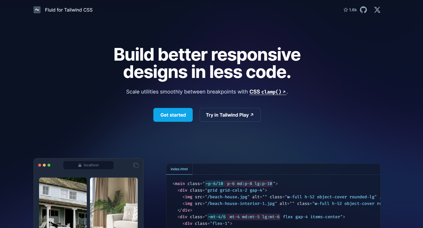
Hi, I’m the rebel kid of the UI development world and a loyal lover of Tailwind CSS! 😎 Tailwind CSS had already stolen my heart with its modern and flexible approach, but when I’m doing responsive design, sometimes I lose it and think, “Man, my keyboard’s going to wear out from typing all these classes!” Defining separate classes for every screen size is a waste of time and drags the code’s readability down to a “wait, what?” level. On top of that, when switching between screen sizes, the designs change so abruptly that it feels like I’ve suddenly been teleported to a different website! 😵 And that’s exactly where fluid.tw steps onto the stage and says, “Chill, bro, I’ve got this!”
The Old Way: Keyboard-Killing Responsive Design
Back in the day, we’d write code like this for responsive design:
<h1 class="text-base md:text-xl lg:text-2xl">Bu bir başlık</h1>Look, it sounds simple, right? But even this code has problems. When the screen size changes, the font size jumps bam, just like that. A smooth transition? No such thing! 😤 And if you want to add more than just font size, like margin, padding or color, your code gets longer and longer until it turns into an epic saga like “Game of Thrones.” A separate class for every breakpoint, a separate “ugh” moment for every class. In short, you get worn out, and your code sulks at you like, “Why did you do this to me?”
The New Hero: Meet Fluid.tw!
This is where fluid.tw comes in, like a true superhero! 🦸♂️ It’s a plugin built for Tailwind CSS that uses CSS’s clamp function to create fluid designs that scale automatically with screen size. Say goodbye to writing separate classes for every breakpoint, because with fluid.tw we get a lot done with very little code!
First, let’s add the plugin to our project, ready? Open your terminal, take a sip of your coffee and type this:
npm install -D fluid-tailwindNow let’s give our Tailwind config file a quick once-over. Don’t go “Ugh, config, seriously?!” — this takes two minutes. Here’s what we do:
// tailwind.config.js
module.exports = {
  theme: {
    screens: {
      sm: '40rem'a,
      md: '48rem',
      lg: '64rem',
      xl: '80rem',
    },
  },
  plugins: [require('fluid-tailwind')],
};
By the way, make sure to read the Limitations section on fluid.tw’s own site. There are a few details there that’ll make you go, “Aha, if I hadn’t known this, I’d have been in for a headache!” 😉
The New Way: Fluid, Cool, Practical!
Once the config is done, the stage is all ours! Here’s how we set the font size:
<h1 class="~text-base/2xl">Bu bir başlık</h1>Or if you want something more specific:
<h1 class="~md/lg:~text-base/2xl">Bu bir başlık</h1>That tilde (~) is fluid.tw’s magic wand! 🪄 Now the font size transitions between screen sizes so beautifully and so smoothly that it gives the design a real smooth jazz vibe. 😎 And it’s not just font size: you can use this approach for margin, padding, and pretty much any style you can think of. Short code, sleek design, and you looking cool!
Why I Fell in Love with Fluid.tw
- Less code, more done: Goodbye to writing separate classes for every breakpoint, hello to responsive design in a single line!
- Smooth transitions: As the screen size changes, designs flow like they’re dancing; sudden jumps are history.
- Flexibility: Use it for everything from fonts to margins, and turn your project into a work of art.
Final Word: I’m Sticking With This One!
In short, fluid.tw has become my new sidekick. Tailwind CSS was already amazing, but with fluid.tw we’re now an unstoppable duo! 😜 Add this plugin to your project too, save time while coding and make people go “Wow!” at your designs. For more details, check out the fluid.tw website, but don’t you dare say “Eh, I’ll look at it later,” because this plugin is waiting for you!
Go on, more power to your keyboard, happy coding, bro! 🚀
Leave a comment
Your email address will not be published. Required fields are marked *